WIX
2026
Wix Side Cart
Leading the redesign of Wix's Side Cart — replacing a legacy iFrame-based Mini Cart with a scalable, mobile-first system built on a Slot architecture. The new cart enables full brand customization, real-time preview, and extensibility across multiple verticals.
Overview
Redesigning the cart experience for a mobile-first world
The Wix Side Cart is one of the highest-traffic surfaces in the Wix eCommerce ecosystem. With 79% of total traffic and 71% of cart sessions originating on mobile, the cart is the primary checkout gateway for the majority of Wix merchants — yet the existing solution was built on iFrame technology that was slow, inflexible, and incompatible with modern mobile experiences.

The Impact
The redesign replaced a rigid, black-box Mini Cart with a scalable Side Cart system built around a modular Slot architecture. Merchants can now fully customize the cart to match their brand, configure it in real time through the Wix Editor, and benefit from a mobile-first layout that reflects how their customers actually shop. The new system also introduced an extensibility layer — five strategic injection points that allow internal verticals and third-party apps to add value without breaking the core experience.
Problem
Merchants were forced to adapt their brand to the system
The legacy Mini Cart was built on iFrame technology — a technical choice that created a rigid, black-box experience with almost no room for customization. Merchants couldn't change fonts, adjust colors, or configure the cart to reflect their brand identity. The result was a cart that felt generic and disconnected from the rest of the site.
The problems ran deeper than aesthetics. The existing cart had very limited design options, low discoverability, no parity with the full Cart Page, no direct Checkout button, missing key features like promo codes and notes, and — critically — no support for mobile. User feedback confirmed the frustration: merchants described the experience as unprofessional and unusable, particularly on mobile where the majority of their traffic arrived.

The opportunity was clear. With 79% of traffic on mobile, the cart was the single most important surface to get right — and it was the weakest link in the purchase flow.
Research
Understanding what merchants and shoppers actually need
The research phase combined competitive analysis, user feedback review, and cross-vertical requirements gathering to map the full scope of the problem and opportunity.
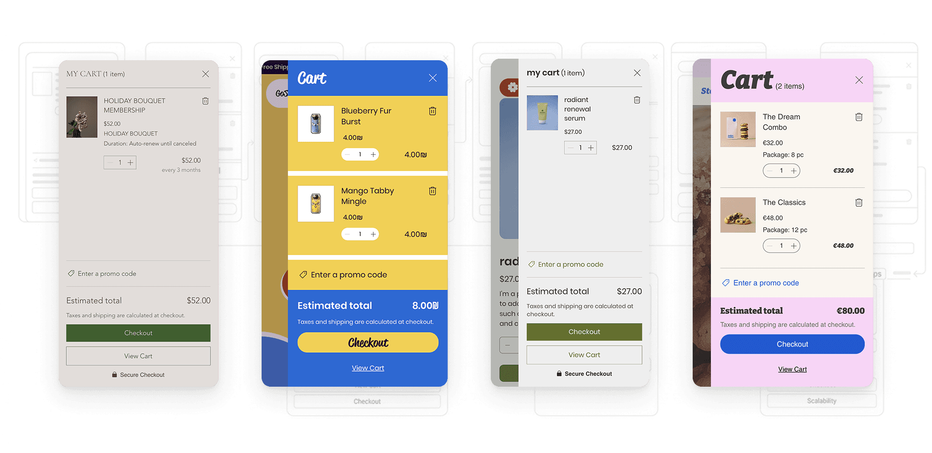
Competitive analysis revealed that market leaders had already moved beyond static cart UIs, offering modular, highly extensible cart experiences that merchants could configure to match their brand and business model. Wix was behind the market standard.
What we learned
Three themes shaped the direction. First, mobile is not optional — 79% of traffic and 71% of carts originate on mobile, making the Side Cart the primary checkout gateway. Second, one size doesn't fit all — Stores, Restaurants, and Bookings each have distinct functional requirements that a single rigid template couldn't serve. Third, extensibility is a competitive advantage — third-party apps and internal verticals need structured injection points to add value without destabilizing the core experience.
These findings pointed toward a system, not just a redesign: a unified architecture that could scale across business types while giving merchants genuine flexibility.
Ideation
Designing a scalable architecture, not just a new UI
The central design challenge was structural: how do you build a single cart system that works across Stores, Restaurants, Bookings, and future verticals — each with different logic, different item types, and different conversion requirements?
The answer was a Slot System — five strategic injection points distributed across the cart UI where internal teams and external app partners could inject content without touching the core structure. The slots sit at the header, after line items, in the customer inputs area, and before and after the footer actions, giving maximum coverage without compromising design consistency.

Alongside the slot architecture, I explored how to bring real-time preview into the Editor experience, so merchants could configure and visualize the cart instantly without publishing changes or switching contexts. Early exploration also focused on cross-team collaboration — working with Stores, Restaurants, and Bookings to synthesize fragmented vertical requirements into a shared framework, running design drills across all relevant panels to ensure visual consistency throughout the system.

Designs
A flexible system built for brand expression and scale
The final Side Cart is built on three design principles: scalable architecture, modular extensibility, and real-time configurability.
The cart is fully customizable through the Wix Editor — merchants can adjust fonts, colors, button styles, layout, and content display options, with every change reflected instantly in a live preview. CSS is applied per breakpoint, meaning the desktop and mobile experiences can be independently optimized for each context.
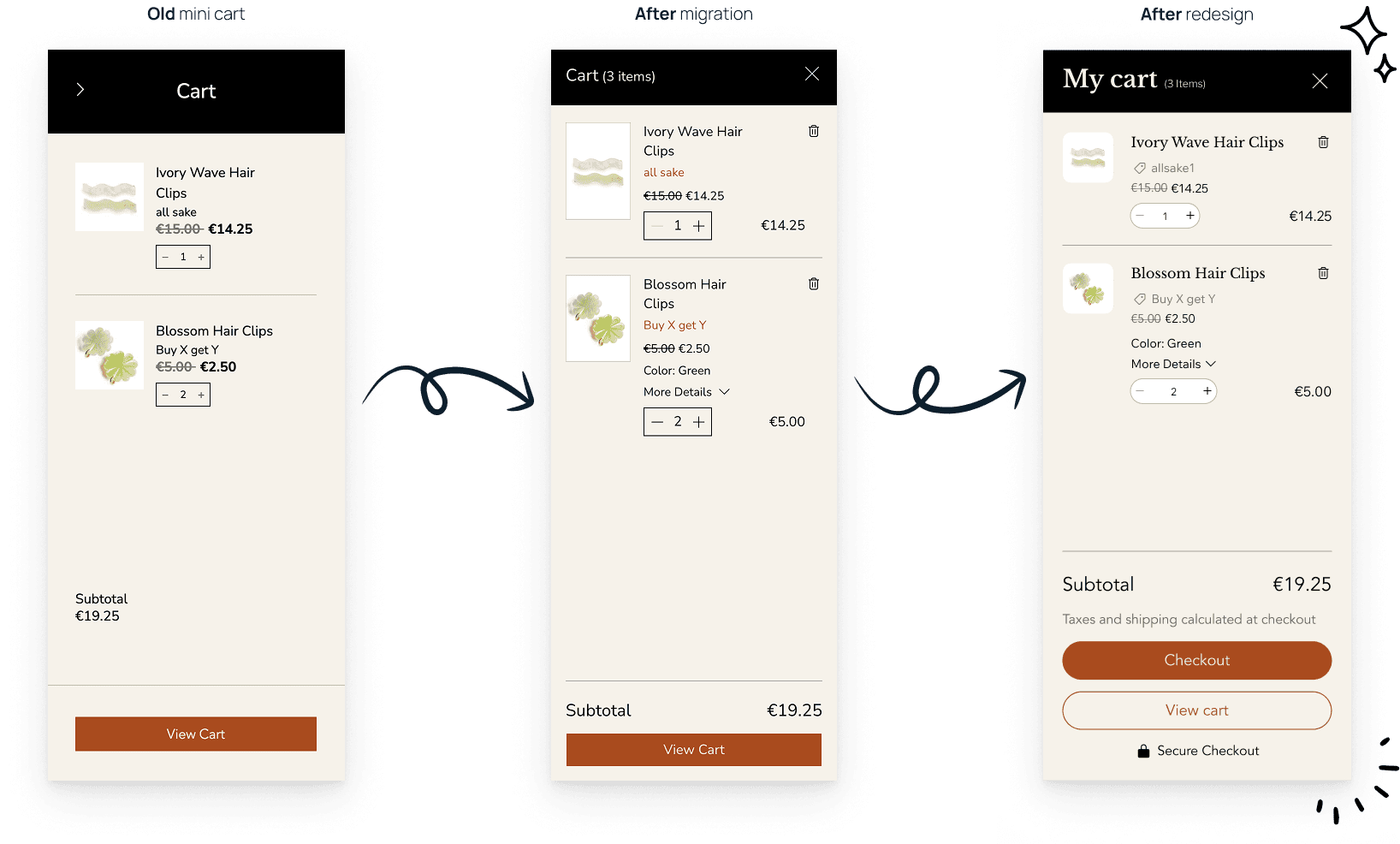
The Slot System provides five injection points that allow apps and internal verticals to embed functionality — upsells, loyalty rewards, donation widgets, vertical-specific item details — without requiring changes to the core cart. This transforms the Side Cart from a closed component into an open platform that partners can build on.

The final design also introduced Cart Page parity, a direct Checkout button, promo code and gift card support, a sticky subtotal, and a fully redesigned mobile layout — closing every gap that had frustrated merchants in the legacy system.
Lessons
Systems scale through alignment, not just design
The biggest takeaway from this project was that scalability is a design choice, not just an engineering one. The shift from a hard-coded iFrame UI to a Slot-based framework required defining clear boundaries, building shared vocabulary across teams, and aligning stakeholders on what the system was and wasn't responsible for.
Cross-vertical harmony was harder than expected — unifying requirements from Stores, Restaurants, and Bookings meant navigating conflicting priorities while preserving a coherent user experience. The solution was treating the design system itself as the collaboration layer: clear constraints enabled independent teams to move fast without stepping on each other.
The other major lesson was about performance as UX. Building on the legacy iFrame made performance an afterthought. The new architecture made it a design constraint from the start — and that shift changed not just the technical outcome, but the quality of every interaction in the cart.
