WIX
2026
Wix Checkout Composer
Designing a unified, real-time checkout customization and live editing ecosystem inside Settings, closing design capability and discoverability gaps.
Overview
Designing a unified checkout editing experience
Checkout Composer is a new feature within Wix's Business Manager that brings together all checkout customization capabilities — design, layout, and form configuration — into a single, cohesive workspace. Before this project, merchants had to move between multiple disconnected tools to edit, preview, and configure their checkout, with no way to see changes in real time.
The Impact
The project unified a fragmented workflow into one place, giving merchants real-time visibility into their checkout while they edit. Phase 1 delivered the Composer page itself — replacing modal-based editing with an inline live preview. Phase 2 expanded design capabilities and introduced Editor entry points, making checkout customization significantly more discoverable.
Problem
Checkout editing was scattered, invisible, and hard to find
The checkout editing experience in Wix Business Manager was split across multiple disconnected surfaces — Checkout Settings, Form Composer, and Header Customization — each responsible for a different piece of the checkout. Users had to navigate between areas to edit, preview, and configure, with no single place that brought it all together.
Making this harder was the fact that checkout is fundamentally different from any other page in Wix. It's the most critical part of the purchase flow, supports many verticals with unique logic, and has historically been locked down to prevent merchants from accidentally breaking conversion. That sensitivity made the problem harder to solve — not just a UX problem, but a structural one.
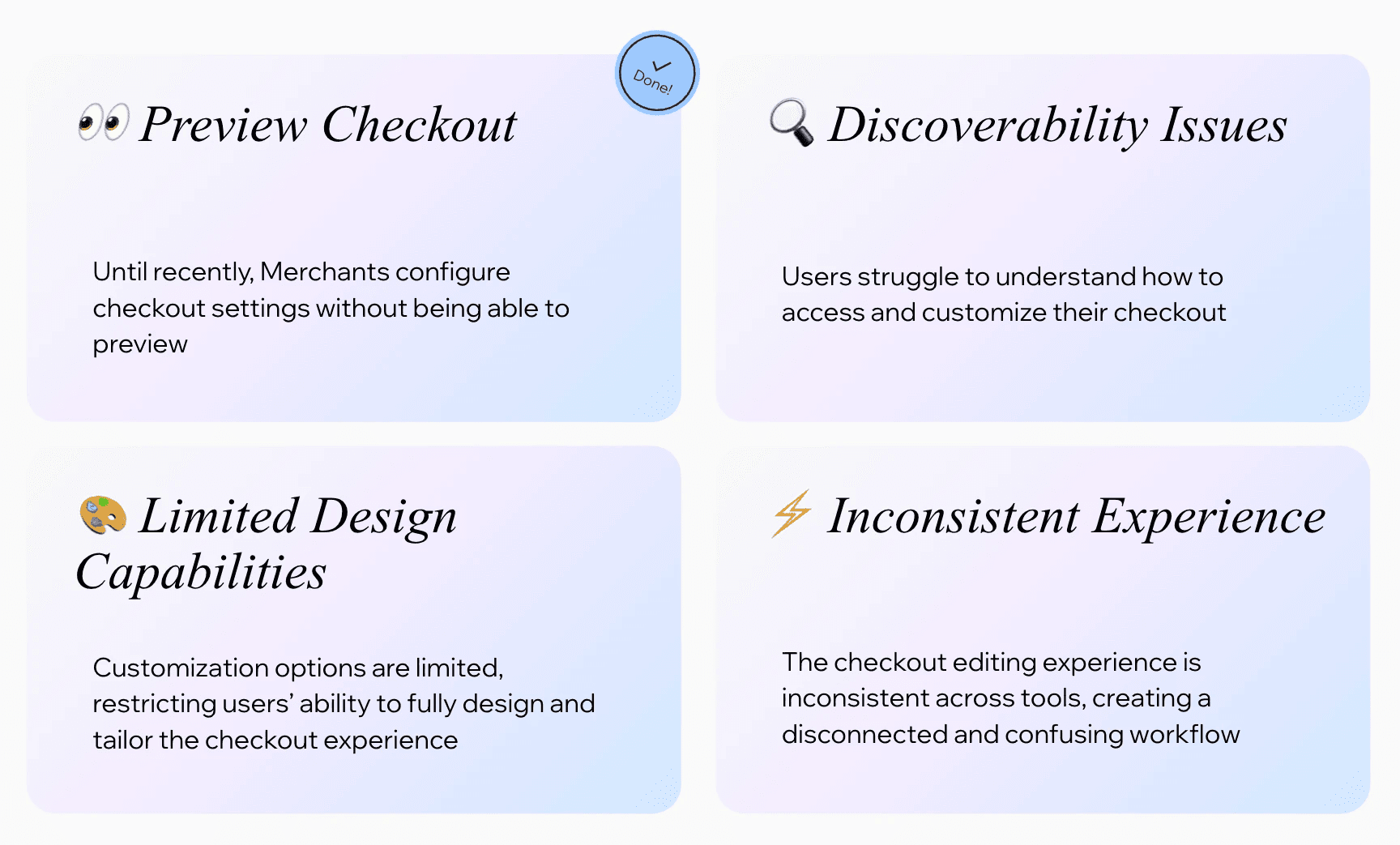
Three core pain points defined the challenge:
No real-time preview — until recently, merchants configured checkout settings without being able to see how changes would look.
Discoverability issues — checkout was the only page in Wix not accessible through the Editor, making it easy to miss entirely.
Limited design capabilities — customization options were narrow, leaving merchants unable to fully align checkout with their brand.
Research
Understanding how merchants think about checkout
To understand the full scope of the problem, I reviewed the existing checkout editing flows, mapped where users were getting stuck, and analyzed how leading competitors approach this space.
Shopify, Squarespace, and WooCommerce all offer a unified editing experience — one place where merchants can design, preview, and configure checkout simultaneously. All of them provide real-time feedback, and most offer entry points directly from the Editor. The gap between Wix's current state and the market standard was significant.
Competitive Landscaping Summary:
Capability | Wix (Before) | Shopify | Squarespace | Stripe Elements |
|---|---|---|---|---|
Direct Preview Entry | ⛔️ Hidden inside Settings | ✅ Accessible from Editor | ✅ Dual Editor entry points | ✅ Unified preview panel |
Real-time State Editing | ⛔️ Static step 1 preview | ✅ Seamless multi-step sync | ⛔️ Basic template layout | ✅ Dynamic inputs editing |
Granular Styles | ⛔️ Header branding only | ✅ Colors, Fonts, Forms | ✅ Theme styles preset | ✅ High level design flex |

User voice
What we learned
The core issue wasn't complexity — it was fragmentation. Merchants weren't confused by the checkout itself; they were confused by the editing experience around it. They didn't know where to go to make a change, and when they found the right screen, they couldn't see the effect of what they were doing.
The lack of a unified surface meant every edit required context-switching, and without live preview, merchants had no confidence that their changes were working. The goal became clear: bring everything together, and make the checkout visible while you edit it.

Current entry points
Ideation
Exploring directions for a unified composer
The central design question was how to bring together three separate tools — Checkout Settings, Form Composer, and Header Customization — into a single workspace without overwhelming merchants or increasing complexity.
I explored different structural approaches: should the live preview be a sidebar, a central canvas, or a full-screen experience? How should the settings panels be organized alongside the preview? What should the entry points look like from the Editor?
Early exploration focused on the relationship between the editing panel and the checkout preview — they needed to feel connected, not just placed next to each other. I also considered the phased rollout: Phase 1 would move the header customization from a modal onto the page and introduce live preview; Phase 2 would expand design capabilities and add Editor entry points; Phase 3 would fully integrate the Form Composer.
This phased structure helped keep the scope manageable while ensuring each release delivered a meaningful improvement on its own.

Exploring the relationship between the editing panel and live checkout preview — testing how controls and context could work together in a single workspace.
Designs
A single workspace for editing and previewing checkout
The final Checkout Composer places a live checkout preview at the center of the experience, rendered in real time as merchants make changes. Settings panels — covering design, layout, and form fields — sit alongside the preview, making it possible to edit and see the result simultaneously without navigating away.
Phase 1 moved the checkout header out of a modal and into the main page, establishing the Composer as the single surface for checkout customization. The settings panel and live preview appear together for the first time.
Phase 2 introduced expanded design capabilities — new color options, layout choices including one-step checkout, and site theme suggestions — alongside Editor entry points that make checkout accessible directly from the pages panel and from cart-adjacent settings like Side Cart and TYP.
Phase 3 will fully integrate the Form Composer into the Checkout Composer, unifying the last remaining separate tool and completing the experience with design presets and smart guardrails that help merchants make better decisions without risking conversion.
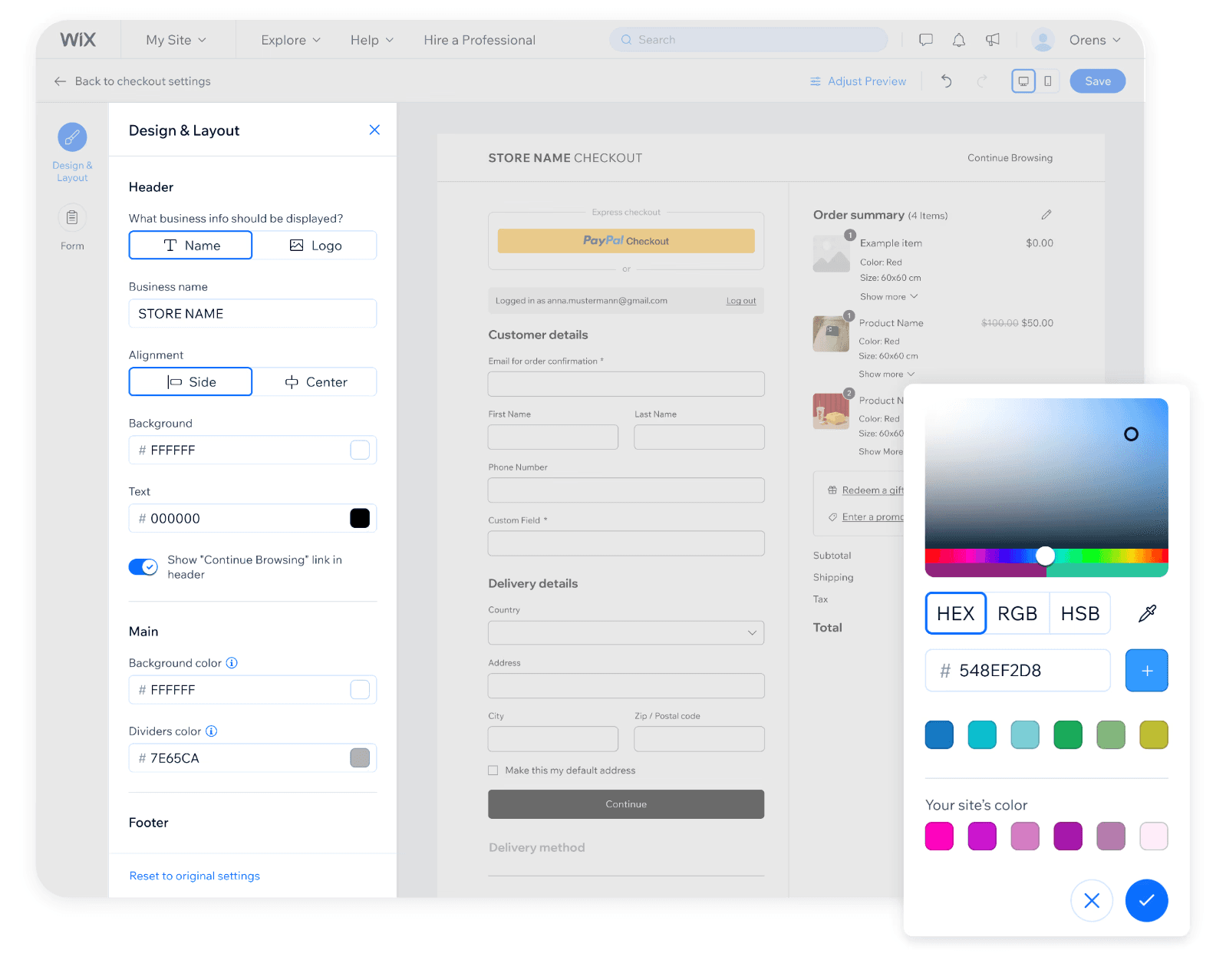

Advanced customization: The 'Adjust Preview' feature grants users full layout control, rendering a real-time, accurate visualization of the entire buyer journey.

Overview of spending trends, category insights, and budget usage designed for faster financial scanning.
Instant card controls allowing users to freeze cards, manage limits, and update payment settings with minimal friction.
A simplified dashboard focused on balance visibility, transaction context, and clearer everyday financial workflows.
Lessons
Unifying tools is as much an organizational challenge as a design one
This project reinforced how much fragmentation in a product often reflects the structure of the team that built it. Checkout Settings, Form Composer, and Header Customization existed as separate surfaces partly because they were built separately, at different times, by different people. Designing the Composer meant working across those boundaries — aligning on what belongs together and what the unified experience should feel like.
The biggest design insight was about visibility: merchants didn't need more options, they needed to see what they were doing. Real-time preview changed the confidence level of every edit. Once merchants could see their checkout while configuring it, the experience felt fundamentally different — even when the underlying capabilities hadn't changed yet.
Phasing the work was also a key decision. Shipping the Composer as a foundation in Phase 1, then layering capabilities in Phases 2 and 3, made it possible to deliver value early and validate the direction before committing to the full scope.
